Best car infotainment systems
Declaring one infotainment system the best over any other is an inherently subjective matter. You can look at quantitative testing for things like input response time and various screen load times, but ask a room full of people that have tried them all what their favorite is, and you’re likely to get a lot of different responses.
Some prefer systems that are exclusively touch-based with a simplistic user interface. Others may prefer a non-touch system that is navigable via a scroll wheel. You can compare it to the phone operating system wars. Just like some folks prefer Android phones over iPhones, we all have our own opinions for what makes up the best infotainment interface.
All that said, our combined experience tells us that a number of infotainment systems are at least better than the rest. We’ve narrowed it down to five total systems in their own subcategories that stand out to us. Read on below to see our picks, and feel free to make your own arguments in the comments.
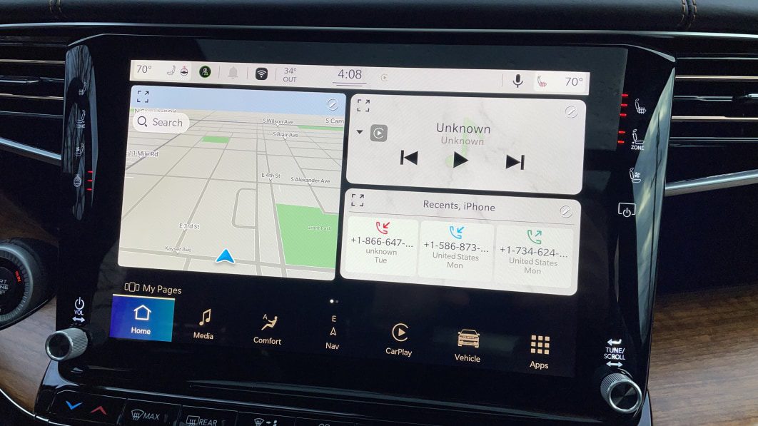
Best overall: UConnect — Various Stellantis products
If there’s one infotainment system that all of us agree is excellent, it’s UConnect. Both UConnect 4 and the latest UConnect 5 software are included in this praise, too. It has numerous qualities that make it great, but above all else, UConnect is simple and straightforward to use.
Ease of operation is one of the most (if not the single most) vital parts of any infotainment system interface. If you’re expected to be able to tap away on a touchscreen while driving and still pay attention to the road, a complex infotainment system is going to remove your attention from the number one task at hand: driving. UConnect uses a simple interface that puts all of your key functions in a clearly-represented row on the bottom of the screen. Tap any of them, and it instantly pulls up that menu. We like the radio/media interface — it’s super easy to swap stations or sources. The menu structure is easy to grasp, and of course both Apple CarPlay/Android Auto are available if you want them.
UConnect 5 is a big visual improvement over UConnect 4, but thankfully it retains the same ease of use as the outgoing system. We’ll also point out that Stellantis is able to adapt UConnect to different screen shapes and sizes with great success — it works stunningly well in the vertical 12-inch screen of the Ram. The software takes full advantage of the extra screen real estate, and it comes with its own screen-splitting capabilities that aren’t possible on the more traditionally-shaped screens.
No matter the application, whether it’s in a Maserati or a Jeep, UConnect is flexible, easy to operate and aesthetically pleasing. It’s high-tech, but doesn’t slap you upside the head with unnecessary features and complications, and it’s our favorite infotainment system of all.
Best luxury: iDrive 7 — BMW
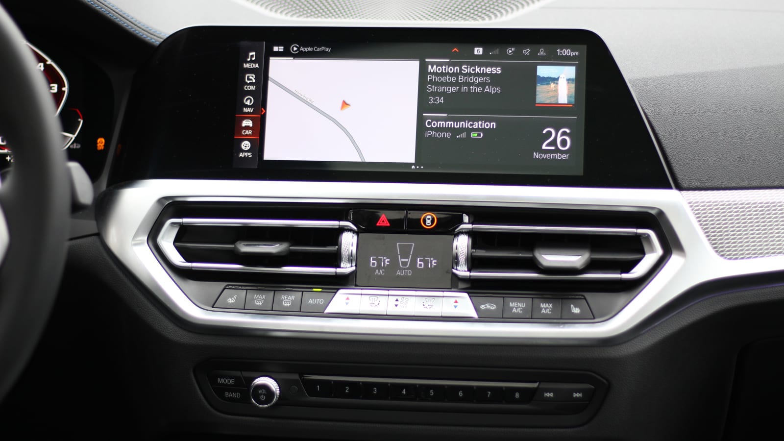
We have to specify “iDrive 7” for this one, because the just-released iDrive 8 is unfortunately a step backwards. However, set aside the new infotainment system for a second, and focus on the goodness that is iDrive 7. BMW’s been consistent with its use of the iDrive knob for years, and iDrive 7 is as good as it gets — and maybe, it’s as good as it’ll ever get.
Infotainment systems from luxury brands, especially European ones, tend to be more complicated than non-luxury-branded systems. That’s no different with BMW’s iDrive. There are tons of settings, menus and displays you can scroll through. However, BMW makes it all manageable with a logical menu structure that you can traverse through quickly and efficiently with the convenient iDrive knob. Said knob is key to this being our favorite infotainment system from a luxury brand, too. It allows you to remain fully sat back with your arms in a natural place and involves far less body movement than using a touchscreen would. This is a big plus for safely using the system while driving. Alternatives like touchpads or the old (and dreaded) Lexus mouse require far too much precision and concentration to operate. The iDrive knob just scrolls, rocks and clicks, making it a natural way to move about the big, bright screens in BMWs these days.
But! If you’re someone who needs to have a touchscreen, every iDrive 7-equipped car can give you exactly that. Plus, the touchscreen itself is an extremely good one, responding instantly to our touches and swipes. We wish we could say the same for iDrive 8, but our experience with this system so far is a frustrating one. The previously easy-to-use menu structure is a scattered mess of tiny icons; the system is generally slower/laggier, and BMW removed physical buttons for climate control/radio controls, integrating them all into the touchscreen instead. It requires multiple touches to accomplish tasks that were easily done in just one touch before.
Despite all the praise we’re giving iDrive 7 here, there are a couple detractors that point out the substandard radio tuning ability. If you’re one to constantly surf random radio stations, BMW’s tuning controls are not easily or quickly accessed. However, anyone who sets their own radio presets or just listens to music via their phone won’t have a single issue. And speaking of the phone, BMW offers both wireless Apple CarPlay and wireless Android Auto in iDrive 7-equipped cars now, which is key to it being our favorite. It wasn’t that long ago that BMW didn’t support Android Auto, and that would’ve been an instant disqualifier to any “best of” list for infotainment systems.
Best non-luxury: UVO/Blue Link — Kia/Hyundai
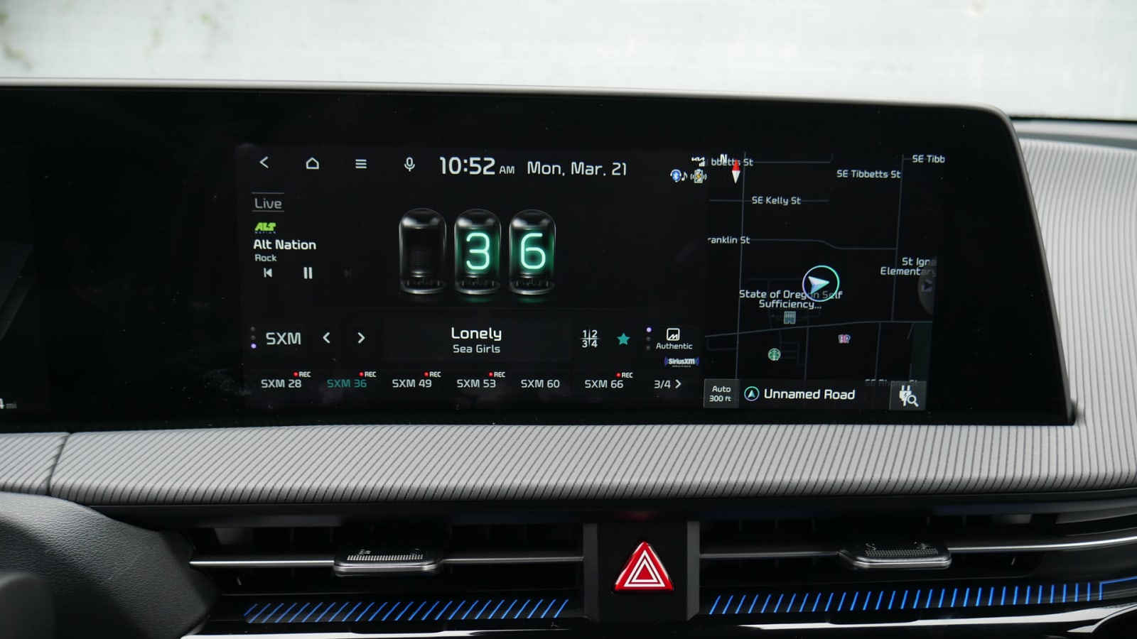
UConnect would be the most natural choice here, but since we’ve already given it the “best overall” recognition, we figured it best to highlight our other favorite infotainment system from a non-luxury manufacturer. We’re halfway cheating here by including both Kia’s UVO and Hyundai’s Blue Link, but seeing as how they’re mostly the same with branding and slight aesthetic differences, they both deserve to be here.
Just like UConnect, the Hyundai and Kia infotainment systems gain our recognition by being easy to operate, super quick and visually uncomplicated. The menu structure offers easy selecting of whatever app you want to use. Its radio interface is easy to navigate, and Apple CarPlay/Android Auto is always supported. We’re frustrated that wireless CarPlay and wireless Android Auto are not universally supported — it depends on the trim/screen size you opt for on some models — but needing to plug in isn’t such a hardship anyway.
Neither Hyundai nor Kia load their infotainment systems up with superfluous features and menus that complicate, so you can’t get horribly lost five menus deep. However, there is the weird “Sounds of Nature” feature that lets you fill the cabin with random soundtracks of busy cafes, falling water and more.
Hard buttons for many infotainment controls are present on most Hyundais and Kias, though its newer products are trending toward using touch haptic “buttons” instead of pressable ones. We definitely prefer the non-haptic controls, but appreciate that Hyundai/Kia are at least still appealing to those who prefer to operate vital car controls outside of a single, central touchscreen.
Honorable mention: Mazda Connect — Mazda
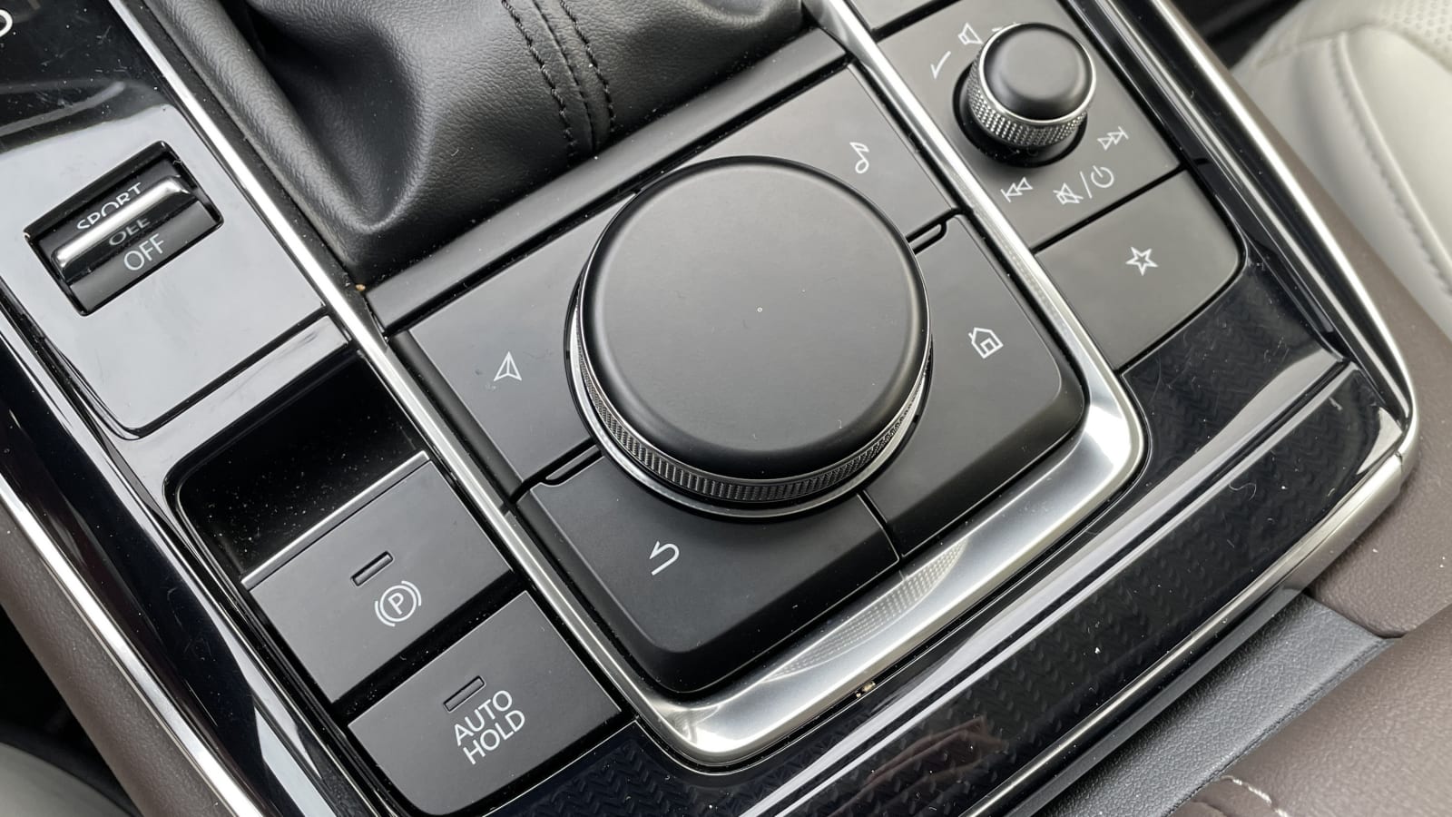
Mazda, as it does with many things, has a specific philosophy when it comes to infotainment systems. For one, the company has some serious beef with touchscreens. Even in the Mazdas that do have touchscreens, touch functionality is disabled as soon as you begin moving. Instead, Mazda would prefer its drivers operate the screen via a knob that is very similar to BMW’s iDrive knob. If you haven’t figured it out by now, we like this line of thinking.
Our recognition of Mazda here only extends to the latest version of Mazda Connect, which has nearly made it to every new Mazda model, but debuted in the Mazda3. Mazda sets the screen back deep into the dash at a distance far more than essentially any other new car, and this is in an effort to cut back on the shifting of a driver’s eyes from the road to the screen and back. This keeps your eyes trained on and adjusted to the road more than others, which is a major key to using an infotainment system safely.
Additionally, the system’s interface is broken down into an ultra-simplistic and clean layout. Most of the screen is filled with black space, and Mazda presents only the information that you absolutely need at any one time. Moving about the system is done in the same way as in BMW iDrive 7 with the knob that scrolls, rocks and clicks. It’s very intuitive, and the menu structure is set up to facilitate this kind of navigation.
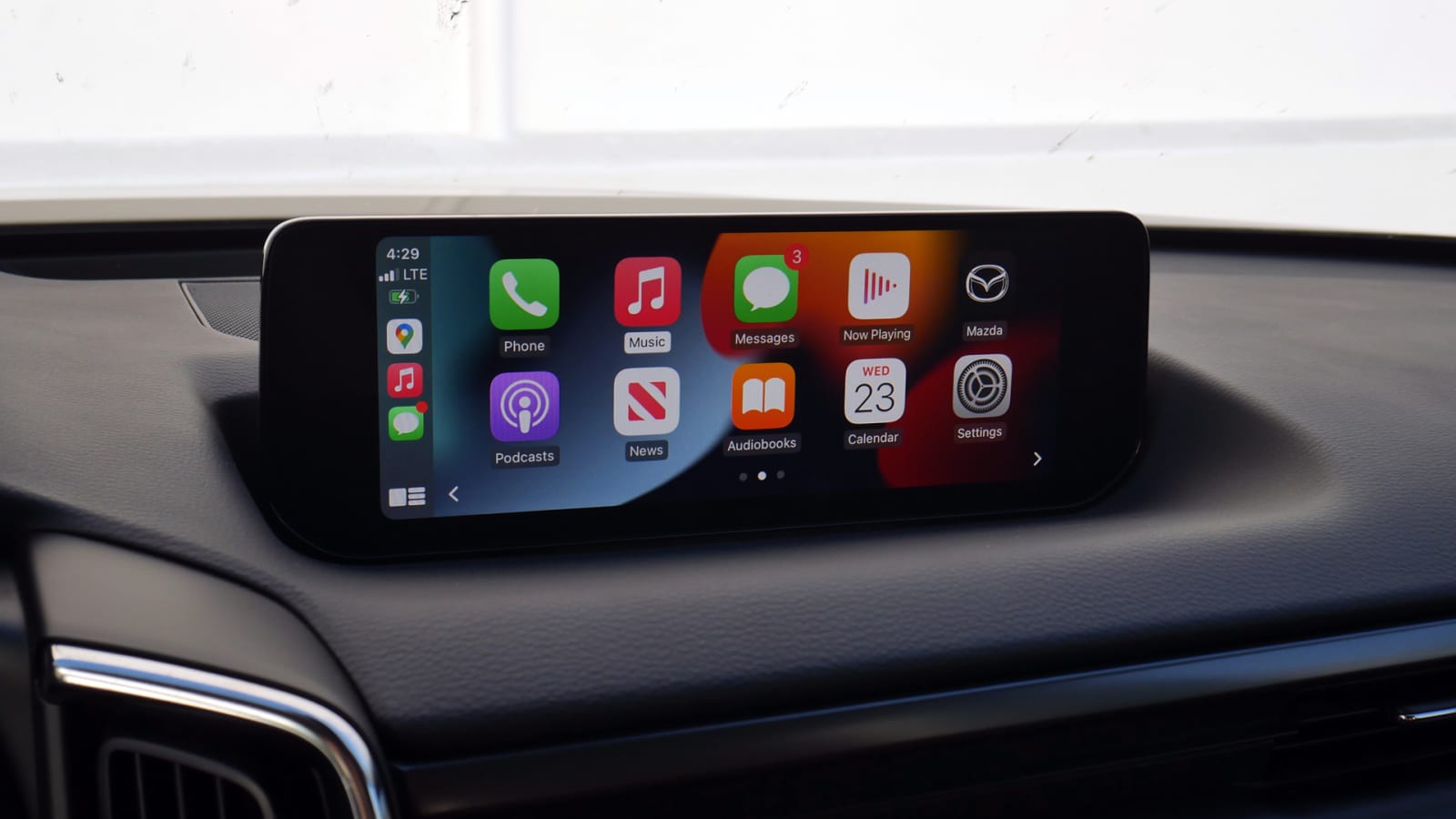
Those who want the latest gadgets and gizmos might be disappointed at the lack of a funky user interface with colors and animations, but anybody who wants to just get the job done as simply and easily as possible will appreciate Mazda’s software.
Our biggest gripe comes from radio tuning. If you like to scroll through various stations frequently, it’s going to be difficult. The lack of presets, non-existent tuning knob and low-feature radio menu make it arduous. But, if you route all of your media through your phone or a few radio stations, there’s no trouble to be had. Using either Apple CarPlay or Android Auto is super easy, too, because you can use the hard buttons on all sides of the knob to quickly switch between apps. Press the “Navigation” button, and it’ll bring up Google Maps. Tap the “Music” button, and Spotify (or whatever music app is playing at the moment) will pop up. Normally, using CarPlay or Android Auto without a touchscreen is a source of frustration, but Mazda’s figured out how to make it even better than a touchscreen with its use of trusty, old buttons.
Honorable mention two: MBUX — Mercedes-Benz
This one’s for the tech geek who wants to be on the bleeding edge. It is not the easiest to use, nor is it the most sensical to use. But, it has more features than any other, and the UI is the most visually enticing/futuristic of all. MBUX is also home to the best voice assistant in the business, which genuinely helps make things easier when you have as many features to find and things to look at as the latest MBUX software does.
Also, there’s a caveat to MBUX being on this list. We’re referring to the latest version of it — debuted on the S-Class — that offers a “one-screen” approach to the home screen with the now portrait-oriented displays. The old MBUX (still in many new Mercedes products today) is considerably worse in that all of your most-used apps can’t be seen on the screen together. Instead, they’re in a carousel of sorts, and you need to scroll through them to find what you want. For the new MBUX UI, everything is right there, easily findable and easily clickable.
The speed at which it reacts, accompanying animations and sheer customization are all as good as it gets for in-car software. On-screen haptic feedback is a welcome feature, and while getting lost in menus is easy, Mercedes gives you a customizable “quick access” tab of sorts that brings up oft-used settings to quickly toggle. Yeah, Mercedes knows this thing is complex, but at least work has been put in to make it easier to use. Don’t seek it out if you don’t want to spend the time to learn how it works, but once you scale the learning curve, there’s a whole lot of good in MBUX.
Related video: