See If You Can Spot The Difference In Lamborghini's New Logo
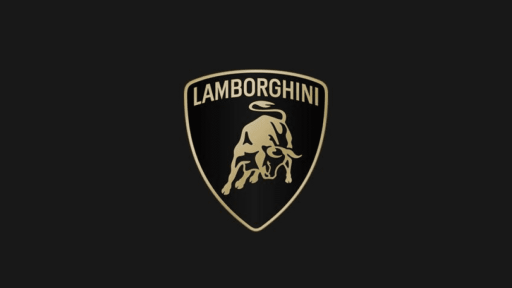
It’s a big day for people whose passion is graphic design, as Italian supercar maker Lamborghini has just rolled out its first logo refresh in almost 20 years. Don’t worry though, as it’s nothing too revolutionary. Instead, the new logo is merely a refinement of the bull badge that the firm first introduced in the 1960s.
2024 Porsche Cayenne S Review : Worthy Of The High Price Tag?
For its new emblem, Lamborghini took a page out of the same design book several automakers have already used to refresh their brands with new badges. Lambo opted for a simplified, flattened version of its old logo, similar to the design refreshes from brands like Skoda, Nissan and Lamborghini’s own parent company, Volkswagen.
As a result is a two-dimensional image of the bull, in the middle of a gold and black shield. The Lamborghini font up top remains, in the same soft-gold hue, which Lamborghini describes as “minimal yet bold.”
It’s a smart and understated rework of the Lambo logo, and will soon start appearing on corporate materials shared by the brand. What’s more, Lamborghini said in its unveiling that the bull at the center of its badge could soon appear alone, and free from its shield prison going forward.
Don’t worry about the signature Lamborghini text in the badge, though, as the brand says it developed a bespoke Lamborghini typeface that’ll be used across its products and communications going forward. Just what that means for Lamborghini owners, though, remains to be seen. Here’s hoping it means we can soon start sending out wedding invites in the Lamborghini font though.
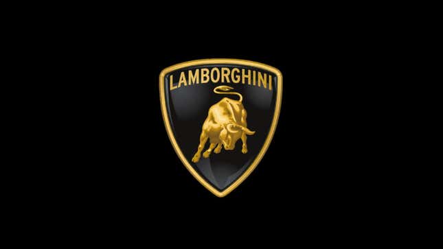
Photo: Lamborghini
What do you think of the new emblem? You can see it side by side with the outgoing badge in the slider above. Unlike some other redesigns we’ve seen recently, it does remain unmistakably Lamborghini despite the changes, and it’s a more thorough rebrand that the one Porsche recently rolled out.
The athletic straining of the bull is something that’s been present on Lambos for decades. Sure, the outgoing logo has only been appearing on the Italian cars since 1998, but the bull imagery traces its origins back to 1963.
Back then, Lamborghini used a red shield with a black bull as its badge. This was replaced by the first black and gold shield in the 1970s, before a black and white badges was used between 1974 and 1998.