Why Are Highway Signs Green?
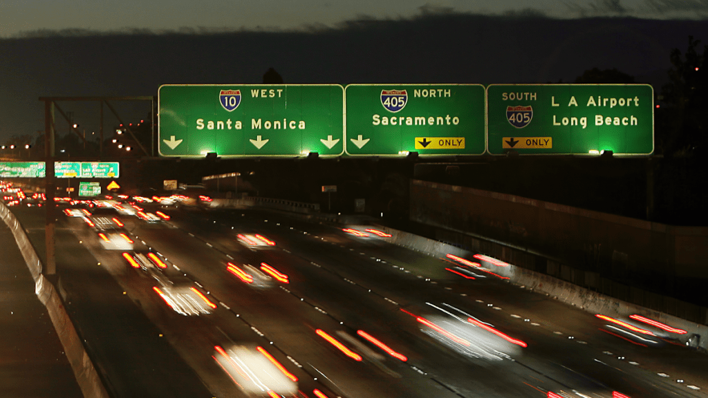
Photo: Gabriel Bouys/AFP (Getty Images)
Highway signs are a ubiquitous part of America’s infrastructure iconography. The U.S. highway shields are probably the most well-known mass-produced piece of aluminum in the country. However, the countless green signs that dot every thoroughfare are a subtle staple for millions of journeys, from daily commutes to holiday road trips. These provide all the information necessary for navigating the system, such as the upcoming exits and the mileage to further flung destinations. Also, the design of these signs has largely been the same since the creation of the Interstate Highway System. Yet, why was green chosen as the official color?
According to the Arizona Department of Transportation, green is used because it is a “cool” color. The sign’s green background tends to blend in with the greens, blues and browns of the natural landscape, while also providing a great contrasting surface for white text. John LaBarbera, an ADOT public information officer, stated, “It blends in enough to be considered part of the scenery, but sticks out enough to notice when you need it.” This explanation from ADOT covers the intuitive line of reasoning behind the choice of color.
The standard of green for guide signs stems from the Manual on Uniform Traffic Devices (MUTCD). The first edition of the MUTCD was published in 1935 by the American Association of State Highway Officials (today’s AASHTO), a standard body consisting of representatives from every state department of transportation. The initial manual was primarily focused on road markings, black-on-yellow background warning signs and black-on-white background regulatory signs across the country. There was no standard for guide signs as long-distance road travel still wasn’t as ordinary as we find it today. Travelers were expected to use route markers and their own maps.
Guide signs were officially standardized as white-on-green background signs in 1954, two years before the passage of the Interstate Highway Act. This significant amendment was included in a 15-page supplement to the 1948 edition of the MUTCD. This supplement also mandated that stop signs be white text on a red background. Prior to this change, stop signs were allowed to be either black or red text on a yellow background, in line with the other warning signs.
Guide signs were officially standardized as white-on-green background signs in 1954, two years before the passage of the Interstate Highway Act. This significant amendment was included in a 15-page supplement to the 1948 edition of the MUTCD. This supplement also mandated that stop signs be white text on a red background. Prior to this change, stop signs were allowed to be either black or red text on a yellow background, in line with the other warning signs. AASHO shied away from red signs in the 1930s because fade-resistant red paint finishes didn’t yet exist.
Photo: artistmac / flickr
The current 2009 edition of the Manual on Uniform Traffic Devices lists the standard for guide sign color in Section 2D.03.02:
“Except where otherwise provided in this Manual for individual signs or groups of signs, guide signs on streets and highways shall have a white message and border on a green background. All messages, borders, and legends shall be retroreflective and all backgrounds shall be retroreflective or illuminated.”
Without this standard, the United States could have ended up with a kaleidoscope of sign colors. Arizona once even experimented with color-coded signs based on direction. Blue for westbound signs, brown for eastbound signs, orange for northbound signs and green for southbound signs.